A HERD OF BEES
“ DO YOU HAVE ANY IDEA HOW HARD IT IS TO DESIGN YOUR OWN LOGO?! ”
– ALLISON HURTHIBISE,
NOVEMBER, 2023 - JULY, 2024
Out with the old
I designed my old logo sometime in 2016 or 2017. I wasn’t 100% happy with it from day-one, but I was frustrated and out of ideas. It’s fine. It does the job and looks great as a wax seal (very important). It’s just sort of generic.
a thousand thumbnails
It was time to move away from the domain name I registered in college and rebrand myself around a pun based on my new (married) last name– Hurthibise, pronounced quickly and with a Yooper accent, sounds like “herd of bees.”
I wanted my new brand to keep the vaguely-eerie mysterious cult vibes of my previous work, but I also wanted the logo to feel hand drawn, and of course, to include a bee. Time to get sketching.
I thought I had a pretty clear idea of the direction this logo should go in. A few sketches, I reasoned, and I was sure I’d land on something that gave me that “yes, this is it!” feeling. Oh, the hubris.
What sort of bee should I model the logo off of? Where do I want to incorporate the eye– a nod to my old logo? What do bee wings look like, and do I want them open or closed? If they’re open that makes the logo awfully horizontal, and I want something that would fit neatly into a square.
On and on for months I’d feel like I was getting close to something, but after sitting on it a bit I’d scrap that design and try something else.
A HAPPY DISCOVERY
Along the way I started playing with how my initials might fit within the body of the bee, mimicking the stripes that would normally be there. I found that if I isolated the letters and shape of the thorax it made a rather nice logo mark.
in with the new
I ultimately landed on more stylized representations of the elements than I’d originally intended. The legs of the bee merge with the surrounding circular frame, and their angles form the negative space of the eye. With thick strokes and minimal detail this design translates well to different sizes, and even better to things like rubber stamps and wax seals.
There’s a chance I may still tweak the position of the legs and antennae, and I’d like to explore options without my logomark, but I’m extremely happy with the direction it’s headed. More than anything, this process has taught me that personal branding is more of a journey than a destination.
brand colors
BLOCK PRINT BLACK
HEX #1A180D
NEWSPRINT
HEX #FFF2D7
OLD GOLD
HEX #9E7C48
HONEY
HEX #D99C4D
WATCHFUL EYE
HEX #FF6225
I’ve always been in love with vintage print pieces. I let myself have fun with distressing techniques wherever I can, and I wanted to choose a palette that complimented those styles and textures. My primary colors evoke old newsprint, faded golds, and printer inks, while a surprising bold orange, used sparingly, draws the eye to necessary information.
DECORATIONS
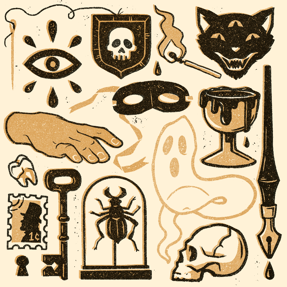
In addition to my logo and logo mark I thought it’d be fun to make myself a collection of small illustrations that I could use here and there to bring a little personality to my online presence. They may show up on social media posts, as background banners on Redbubble or Linkedin, or even on this site if I feel like a page needs a bit of visual interest.
These little guys also serve as a glimpse into my favorite illustration style for anyone unfamiliar with my work.
BACKGROUND NOISE
I was more than a little skeptical when AMC announced a TV show based on Anne Rice’s Vampire Chronicles series. I loved the books when I was in high school, but remembered them as over the top and impossibly campy. The show, despite my reservations, reinvents the story in all of the right ways. Characters are changed for the better, the sets, costuming, and attention to detail are magnificent, and the chemistry between all of the actors is more than I could have hoped for.


