SPIRIT HOUSE
Spirit house is a funeral home turned distillery located in Menominee MI. When they reached out to me, the owners April and Kyle had already worked with other designers, but hadn’t landed on a logo, or even a name, that felt right for their vision.
LOGO DESIGN & EXPLORING BRAND IDENTITIES
April and Kyle weren’t sure yet what they would call their distillery. They knew they wanted an old-world, hand-drawn feel, but the rest was still up in the air.
With a list of paths of interest to consider I sat down with a giant page of newsprint and got sketching in the hope that seeing their ideas on paper, literally, might spark something.
GETTING WARMER…
I was immediately enamored with the name ‘Spirit House.’ The couple had just purchased a funeral home, originally built in 1880, and were in the process of converting it into a distilling facility, cocktail bar, and event space.
What could be more appropriate for such an interesting venue than a name that calls back to its history?! With that, I started exploring how Victorian funerary imagery might pair with the liquid spirits they’d be creating.
…AND WE HAVE A WINNER!
When I showed April my sketches she immediately zeroed in on a thumbnail in the center. While it was originally designed to go with a different name option, the logo was exactly what she didn’t know she’d been looking for.
Paired with a hand-drawn typeface, the Spirit House logo feels like an old woodcut or lithograph. It has an air of mystery- who is that peering at you from behind the door? Could this house be haunted?- yet it’s not so spooky as to drive away more timid clientele.
Primary brand colors
EERIE BLACK
HEX #101820
DOVE GRAY
HEX #D7D2CB
NICKEL
HEX #737071
The three primary brand colors for Spirit House are subtle shades of black and grey. I wanted to keep them monochromatic and understated, a nod to the Momento Mori gravestone art which inspired the logo, and neutral enough that they wouldn’t clash with the more colorful secondary palette.
SECONDARY brand colors
WHISKEY AMBER
HEX #A6631B
GIN TEAL
HEX #005E5D
VODKA BLUE
HEX #425563
RUM VIOLET
HEX #5D3754
AMARETTO RED
HEX #823B34
LIMONCELLO GOLD
HEX #BD9C3F
COFFEE BROWN
HEX #775135
SMOKED BRISKET
HEX #4A2222
BARREL AGED OLIVE
HEX #585C3B
Spirit House’s secondary colors were allowed to be more varied, as each one represents one of the liquors they distill. Pulled from Victorian-era wallpapers, these colors are rich and engaging, but never obnoxiously bright or modern.
LABEL DESIGN
The Spirit House labels are hand illustrated with a custom die-cut for a unique silhouette. Each liquor has its own background color chosen from the secondary color palette and features the signature of owner and head distiller, Kyle.
I wanted these labels to have the same vintage woodcut look as the label, and incorporated the shaking hands sketch from the first round of logo exploration. The overall shape of the label is meant to bring to represent the lock plate from an antique door, while the logo serves as the actual keyhole.
APPLICATION
The Spirit House brand look is sophisticated and a little bit mysterious. A potential website would have a simple layout mimicking the design of the in-house menu cards, but would be packed full of information on community events, activities, menu offerings, and more.
The luxury feel would extend to elements within the distillery- elegantly designed menus on thick watercolor paper and letterpressed coasters would be a tactile delight to patrons.
BACKGROUND NOISE
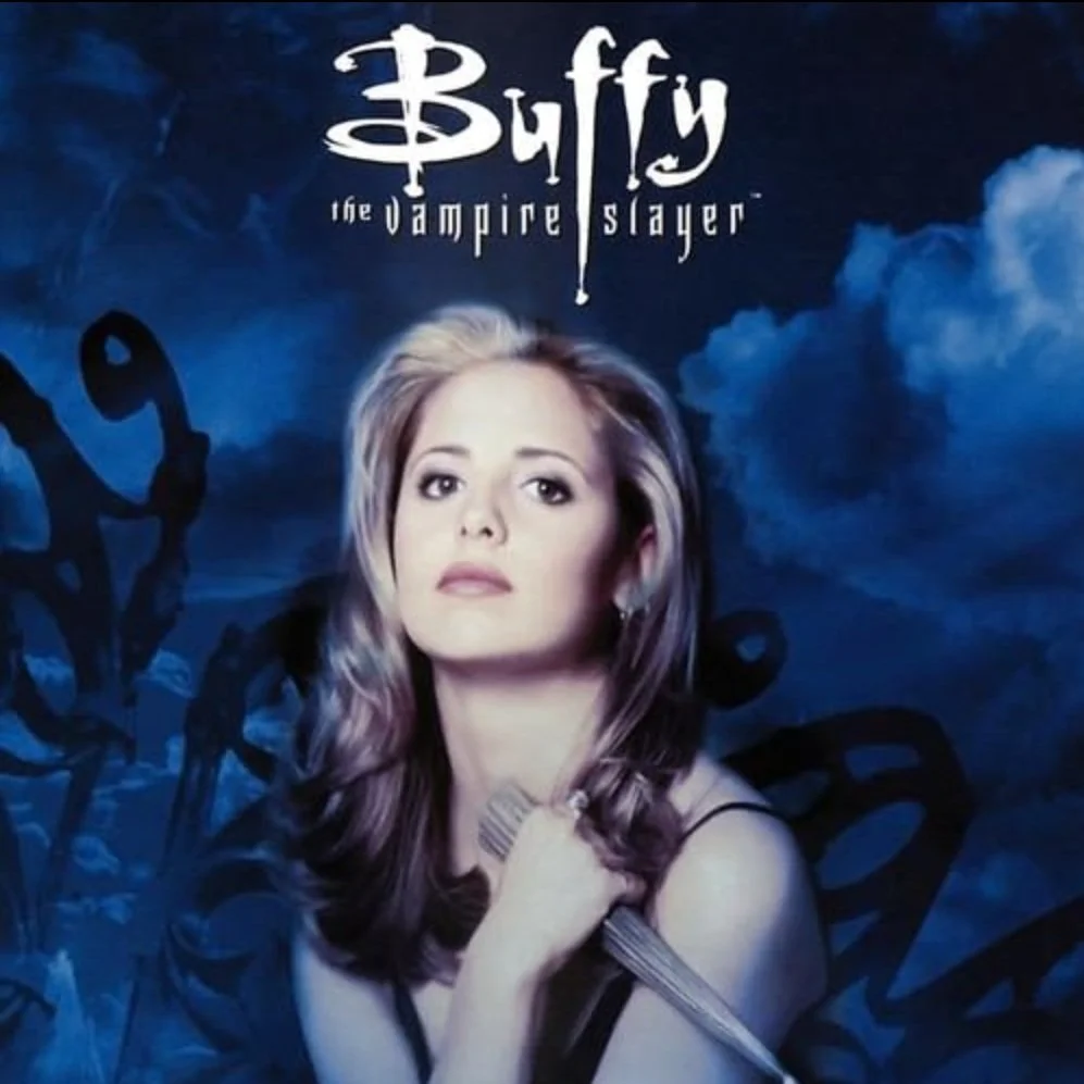
Just before meeting April and Kyle I’d started a re-watch of one of my all-time favorite tv shows- BUFFY THE VAMPIRE SLAYER. I distinctly remember being in middle school and becoming instantly hooked on the first episode I caught on TV (Buffy vs Dracula from season 4). Streaming wasn’t an option back then, so I had to rely on out-of-order reruns to fill in the first three seasons, but I was nothing if not dedicated.
As an adult I like to revisit Buffy every few years, from start to finish. Maybe skipping Bad Eggs if I don’t want it to taint the memories of the project I’m working on.

